
USER INTERFACE FOR A CELL BIOPROCESSING UNIT
This was a 9 months long end-to-end collaboration with engineers and scientists at GE. The brief was to design the User Interface for a device used in cell filtration. The processes were manual a few years ago and now computers and connected systems are revolutionizing the way cell filtration and expansion are carried out in labs.
As the lead Interaction Designer on the project I had to start by talking to scientists and understanding their existing manual methods and protocols. Concept sketches and paper prototypes were further created and tested with the users. I also conducted extensive workshops with HW/SW engineers, managers and end users to reach a holistic design solution. I developed animated interactive prototypes on flash and tested them on an iPad. From deciding the screen type to working out the behaviour of the tiniest button; every decision was sensitively conceived, tested, iterated and realised. Understanding manual procedures, task-flows, system architecture and translating them into wireframes is super duper fun and I dig doing it. Take a look at some of the key stages of the design process below.
SUPER USERS
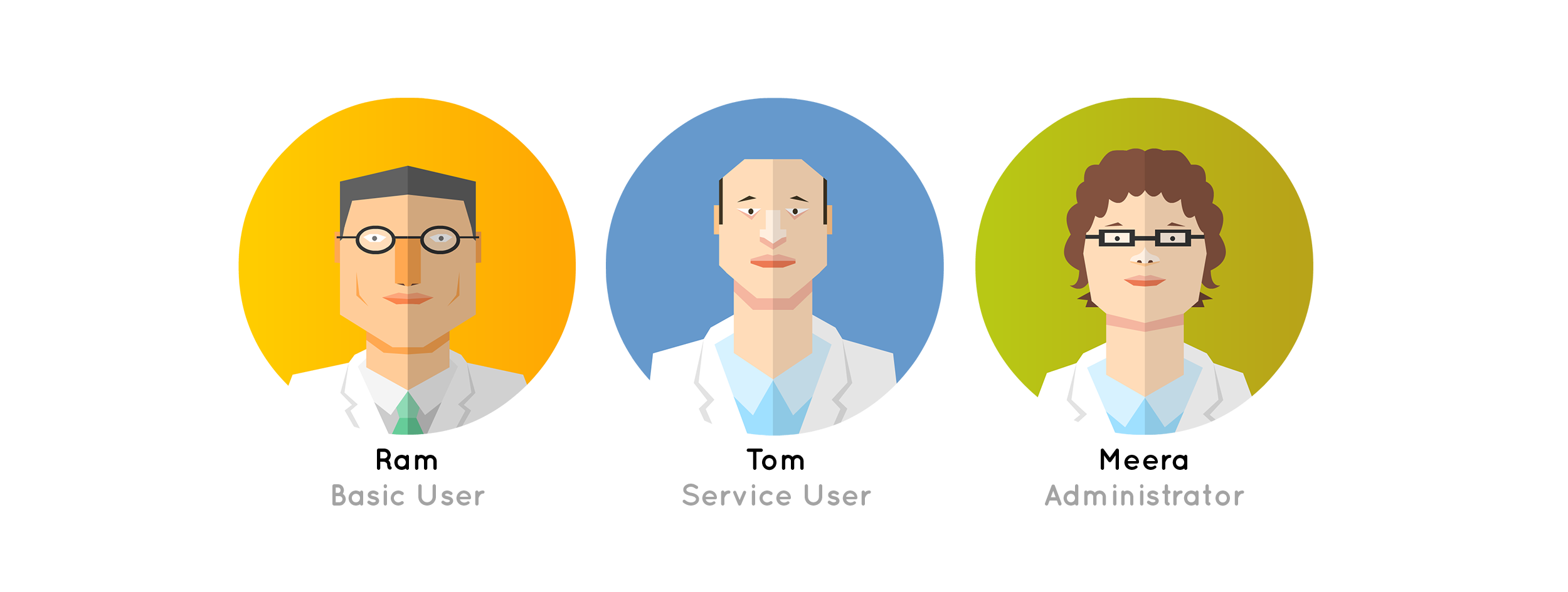
Understanding user personas was the best part of this project as I got to meet some very amazing scientists and learn about their approach to not just their work but life in general. At this point, developing a stakeholder-like-relationship was essential as when the end user is invested, the process has an added perspective. As a part of the early observational research one of the most interesting things were that the users wore gloves all along the procedure. This had a huge impact on the affordance of UI items across the solution.
CO-CREATION
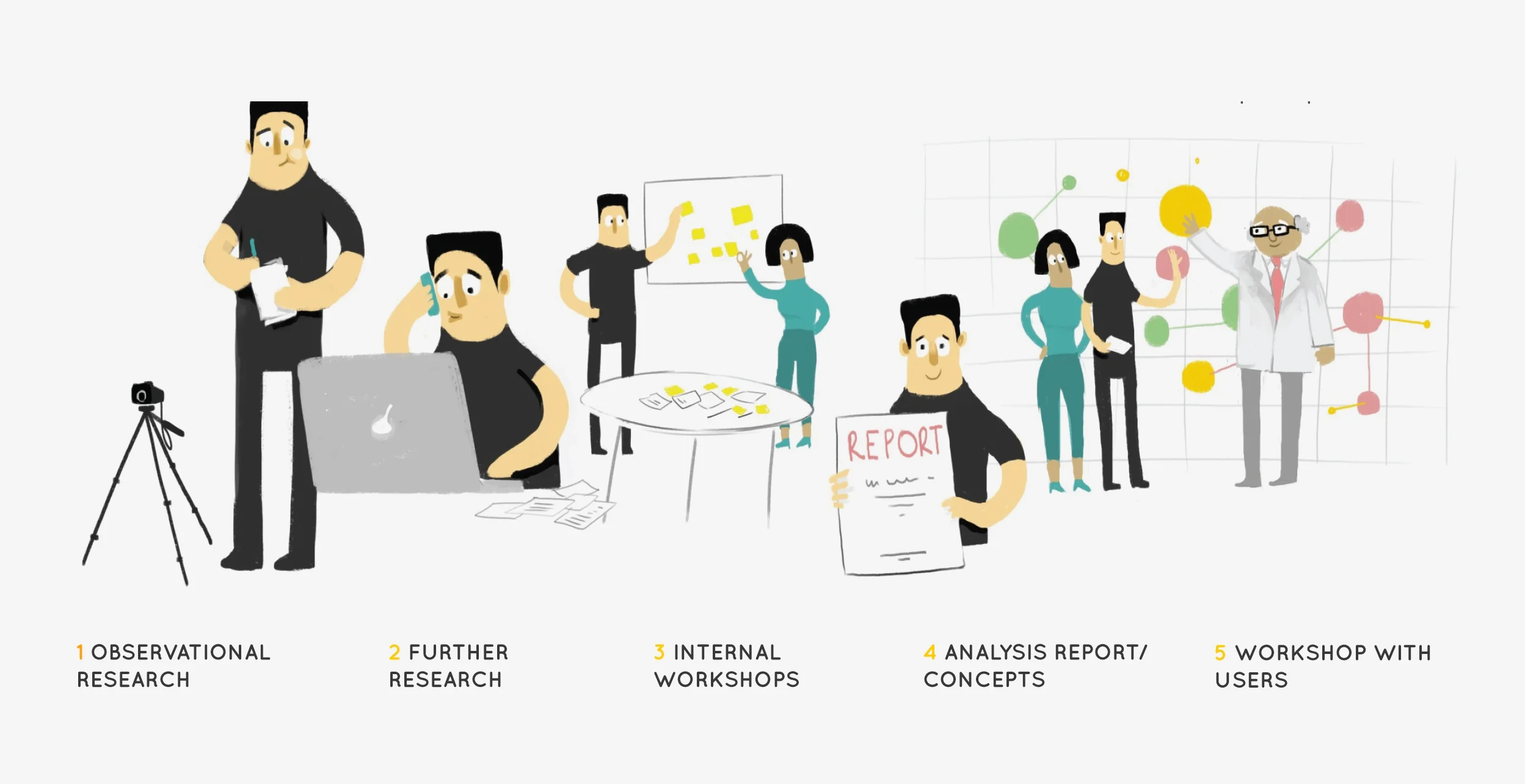
Co-creation was a very essential part of this project as there weren't any predecessors to the system to learn from. All the insights had to come purely from users and observations around their tasks.
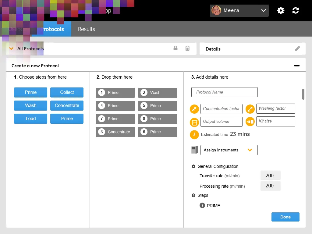
Understanding the task flow with the user
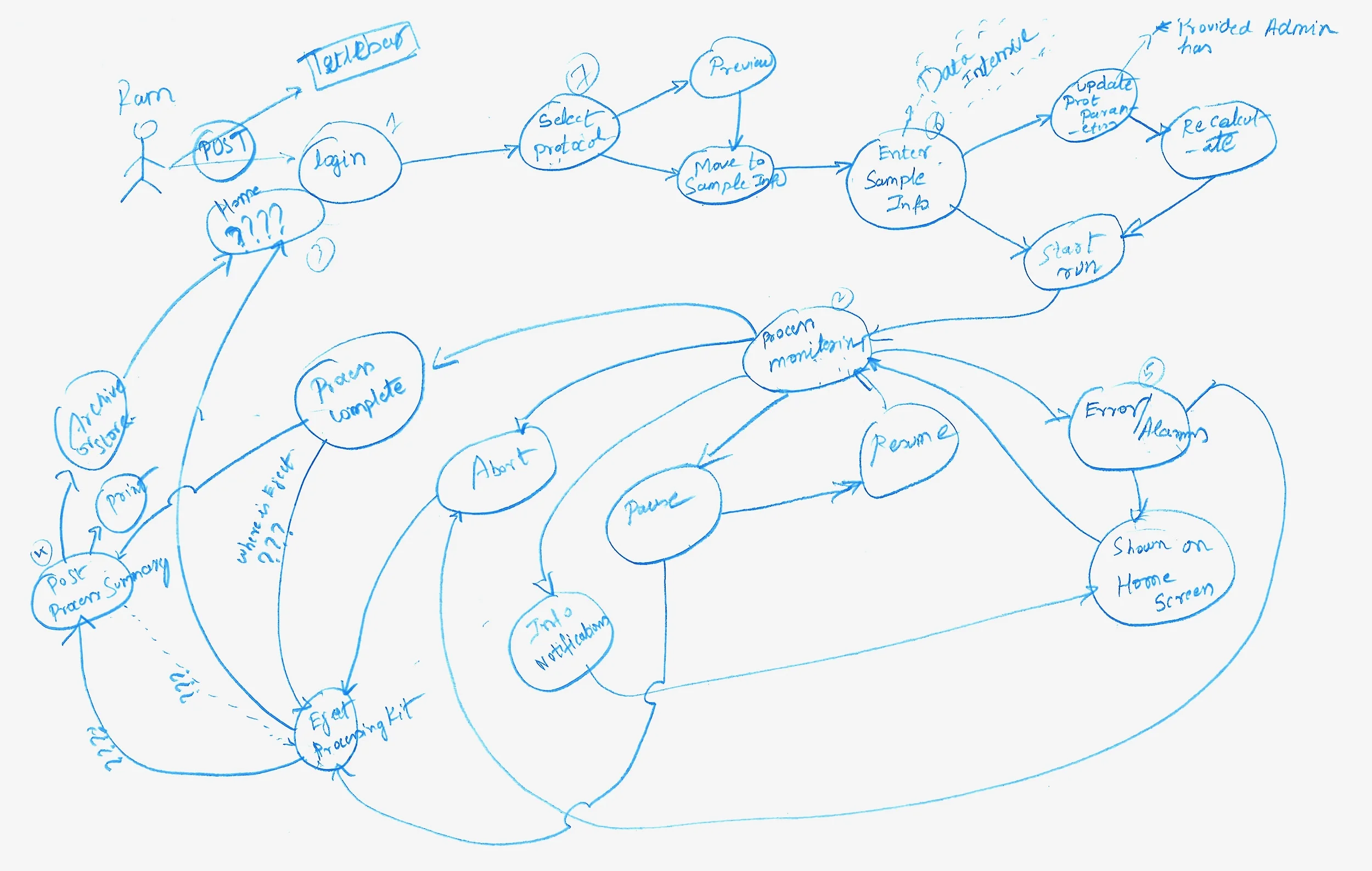
REFINING THE FLOW
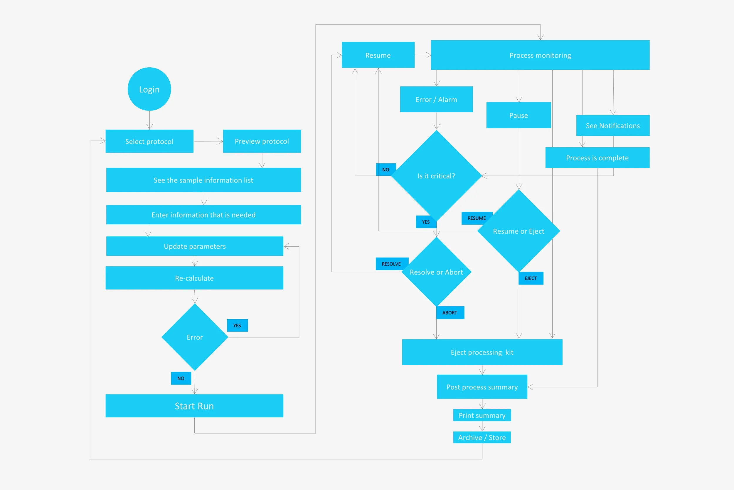
The refined task-flow above is one of the early ones that were drawn out to communicate between the users and the engineering teams. Although, I realised that something more tangible was needed in order to get valuable feedback. I then quickly made some concept sketches and stitched them together into navigable prototypes.
CONCEPT SCREEN_1 of MANY
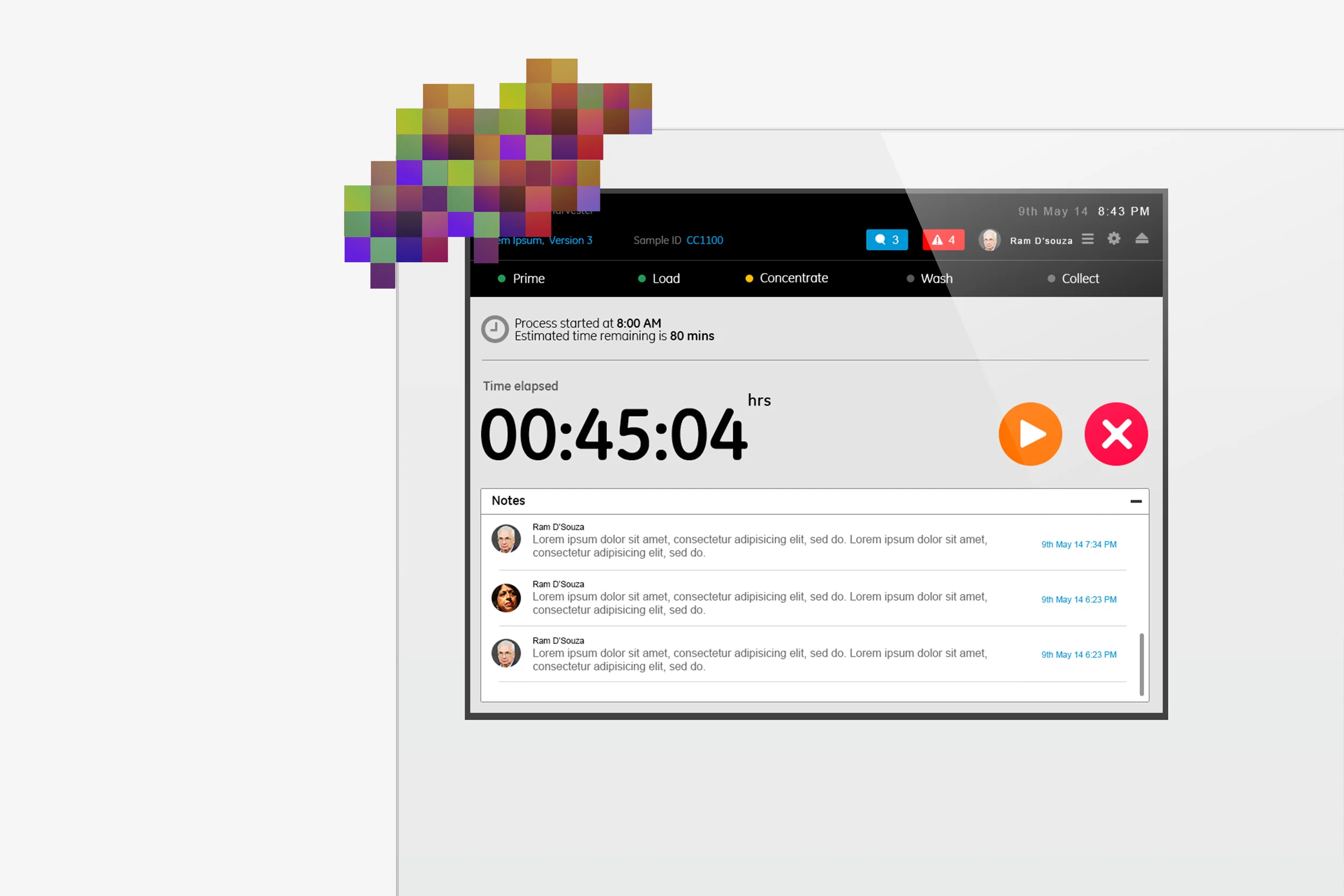

Users in a lab environment run tests that can go upto hours. Each basic user runs multiple tests and is expected to keep track of all tests simultaneously. Although, in an automated system, at any given point of time there is only a certain kind of information that needs to be shown on the screen. Alarms and notifications on the other hand must demand attention based on priorities. The above screens are examples of a state where in the user is seated in front of the system. Key tasks such as Run and Stop have been given more affordance as is the key information that is Time elapsed/Time left. All other information and action items are categorised and stored accordingly.
FROM TEN FEET AWAY
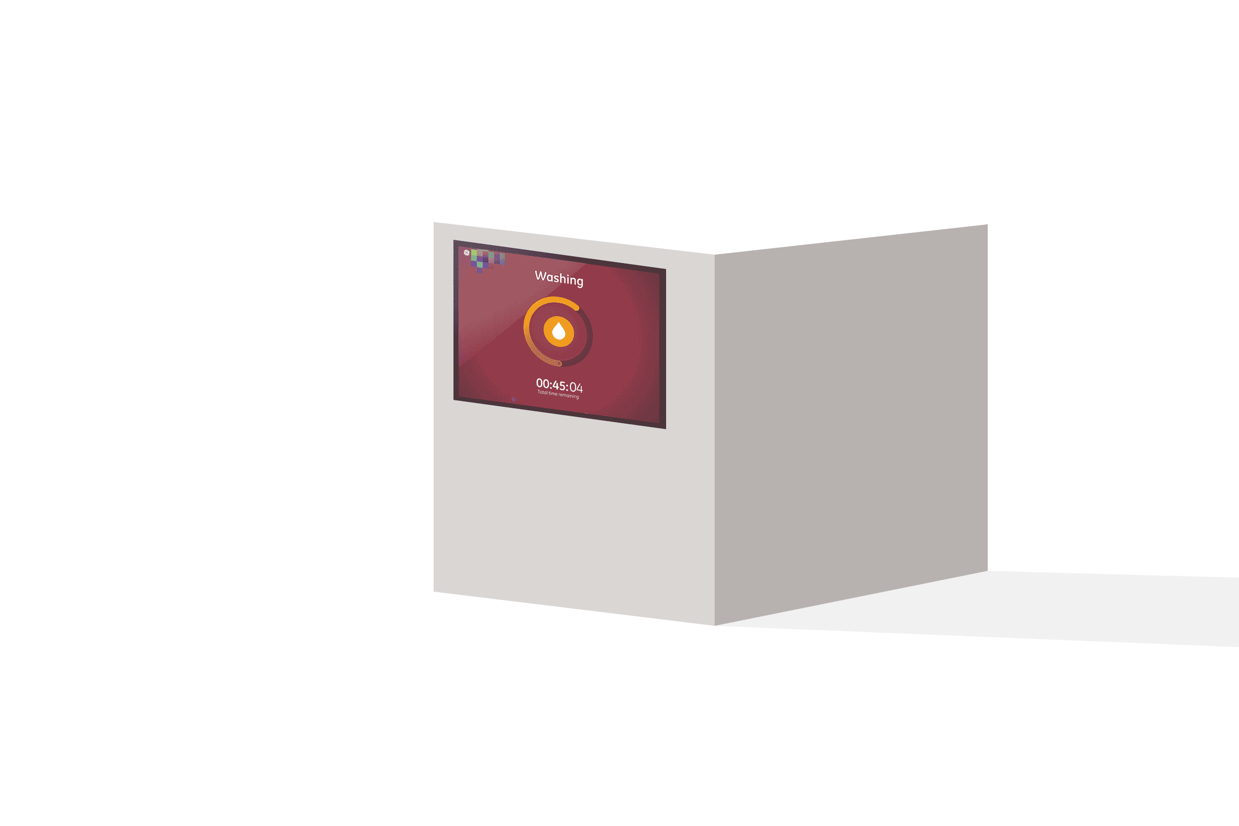
The screen above is a state where the user is freely moving around in the lab and can see the process stage even from a distance of 10 feet. This gave immense flexibility to the technicians and reduced the overall cognitive overload.
ALARMS & NOTIFICATIONS
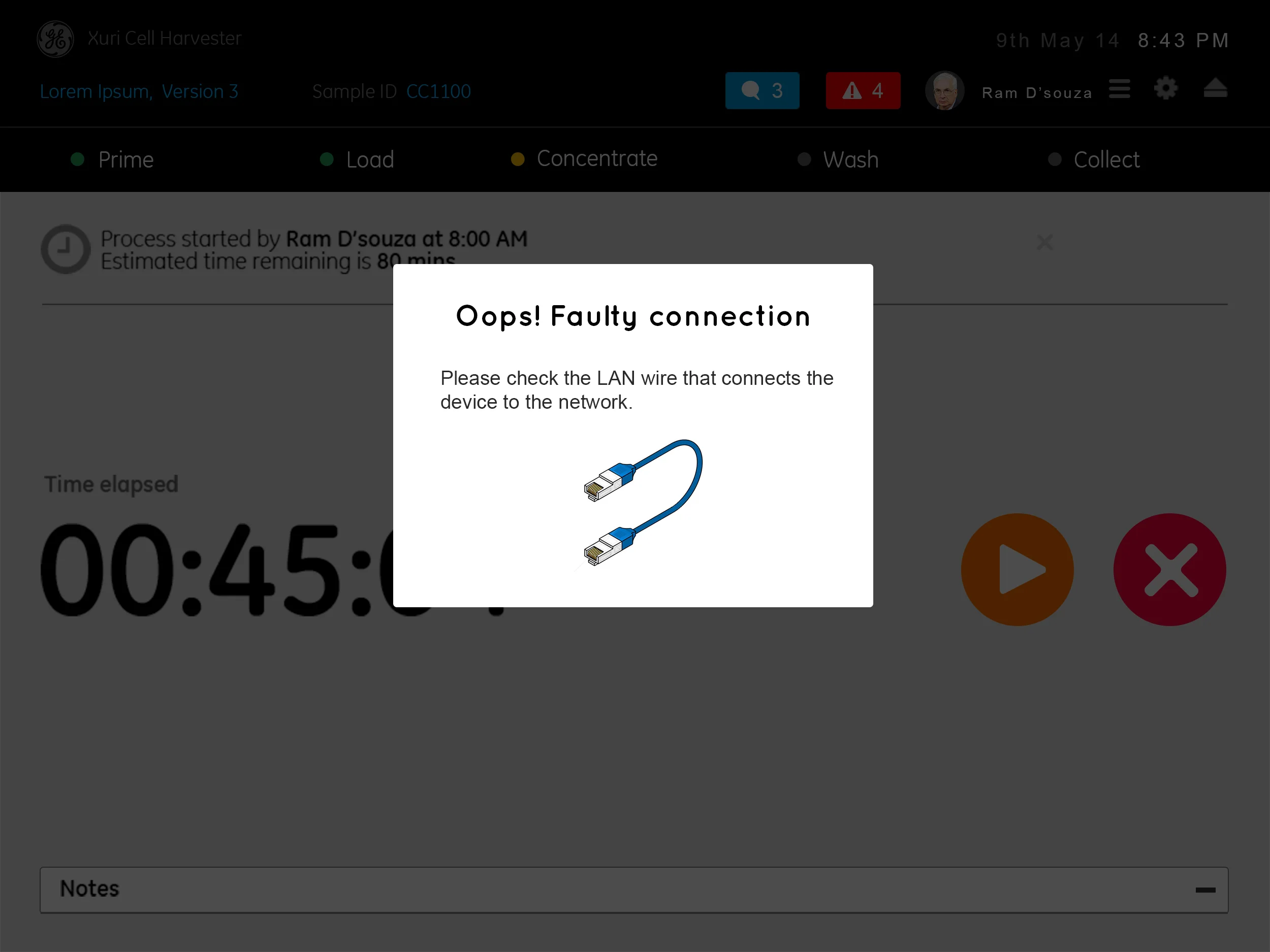
I worked on the design of alarms and notifications and suggested the use of a friendly tone of language. A content writer was hired and a system-wide language redefinition was done within the product range.
ERGONOMICS VS USER EXPERIENCE
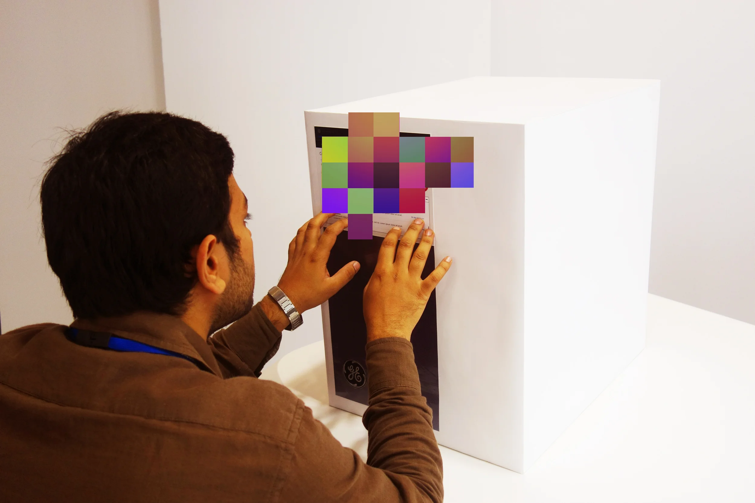
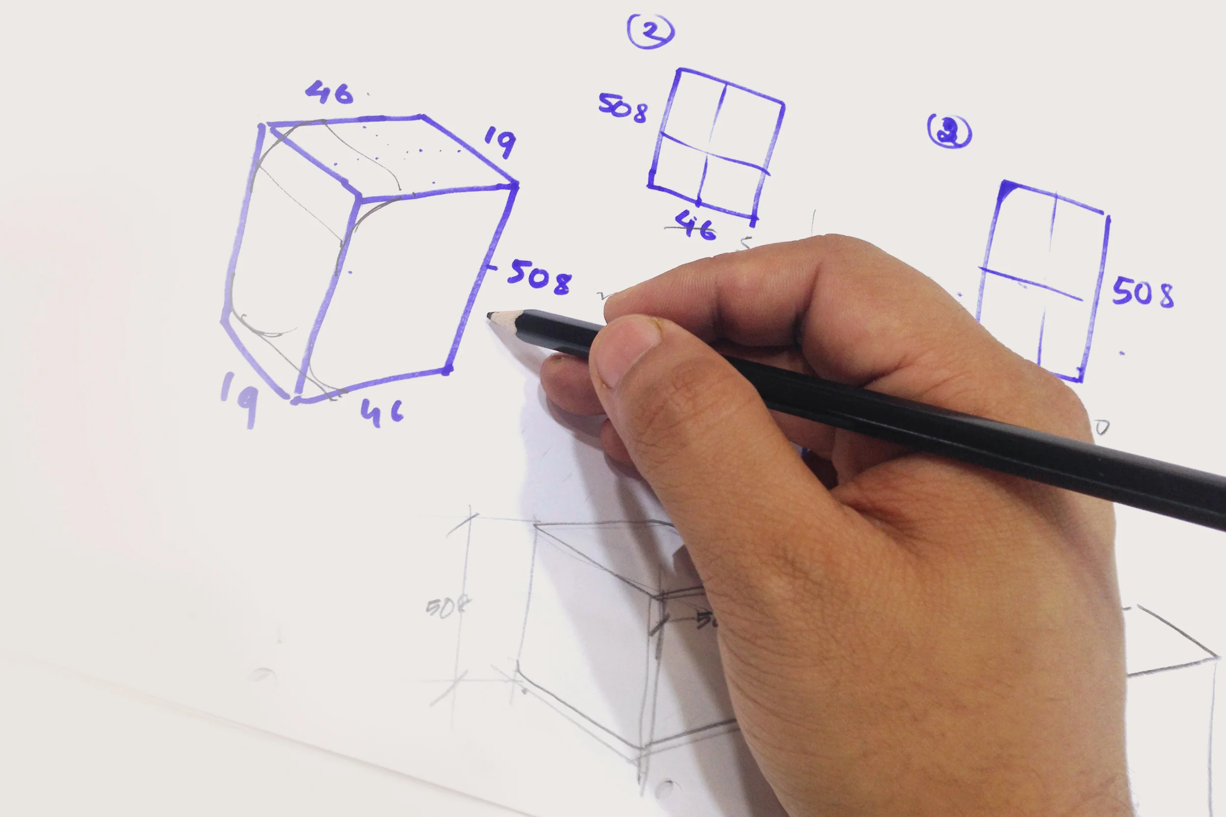
Often in the case of technology led projects, design ends up being involved in later stages of product development. This was no exception. The hardware was already put together before it arrived on our doors and the interface was expected to fit the design. At this point, I strived to make the stakeholders understand the problems associated with an interface that was perpendicular to the base. I made block models of the product to help visualise the scenarios. Alternate screen pivot systems were considered and a no keypad system was further proposed for the future.
INSPIRATION FROM THE PAST
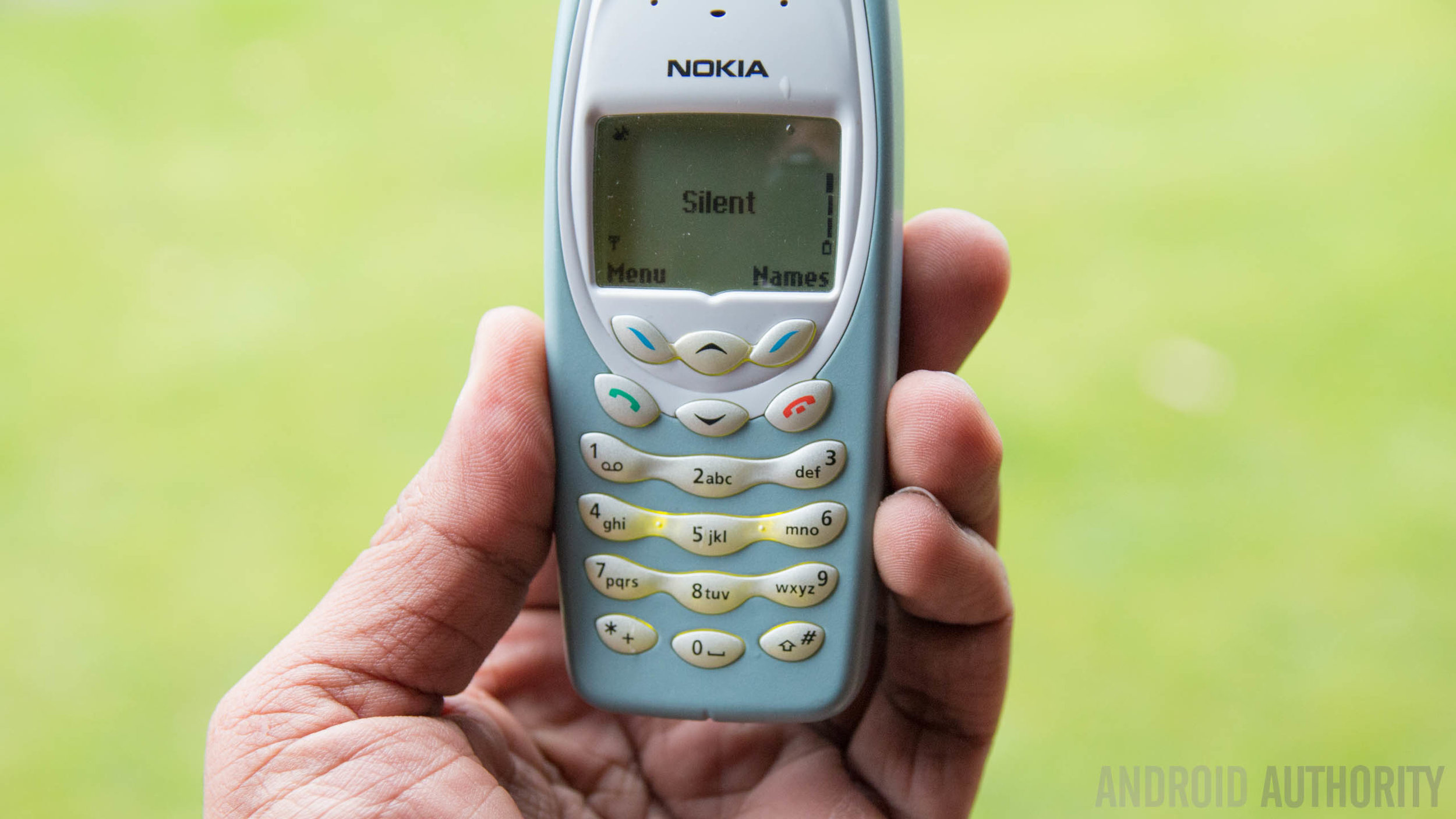
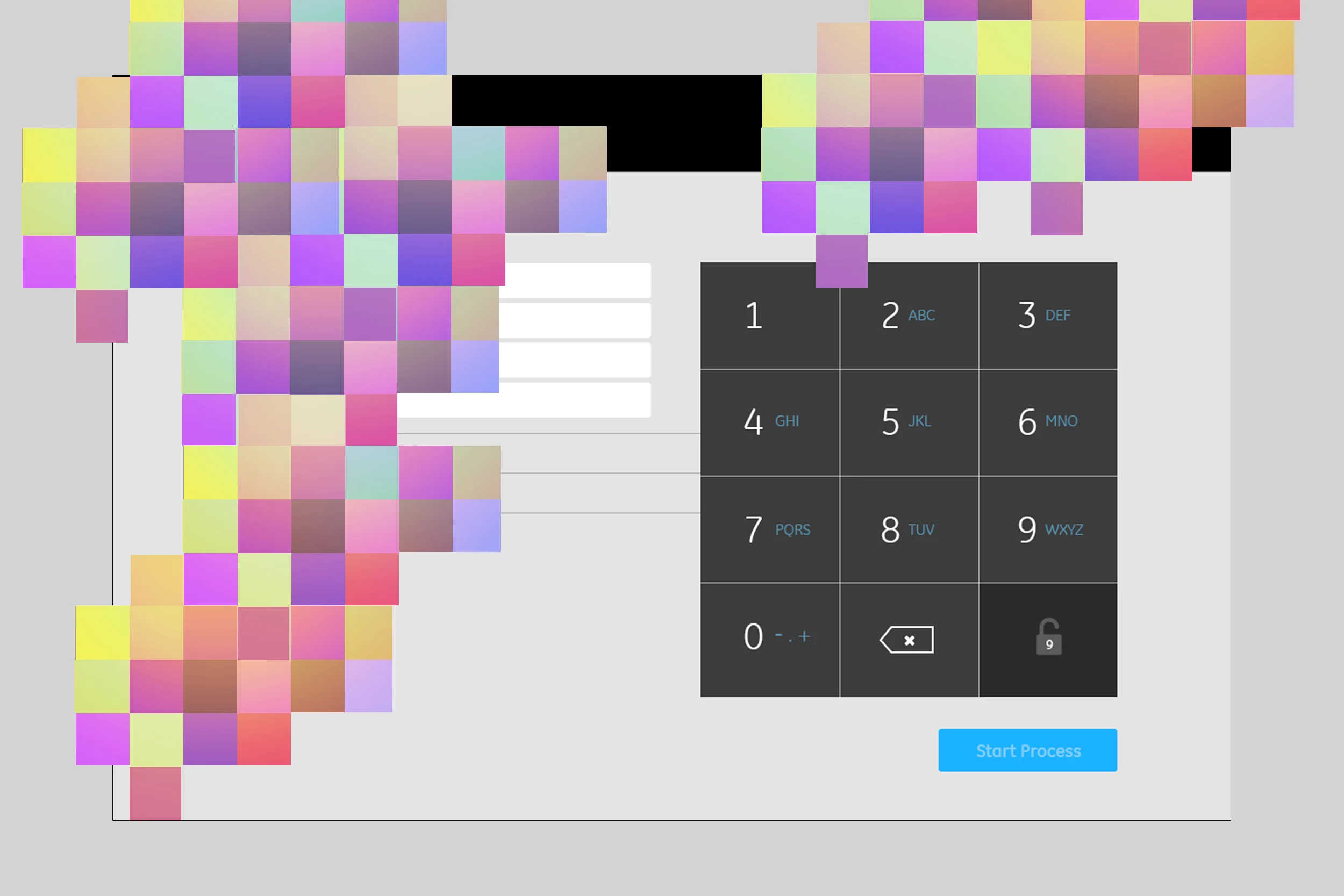
The interface required a considerable amount of form filling but fortunately most of the required information was in the form of scanning barcodes and entering numerals. Hence, my solution was to include a keypad inspired from old mobile phones rather than having a full fledged windows keypad alphabets. This was highly appreciated and resulted in faster data entry.
DATABASE management system
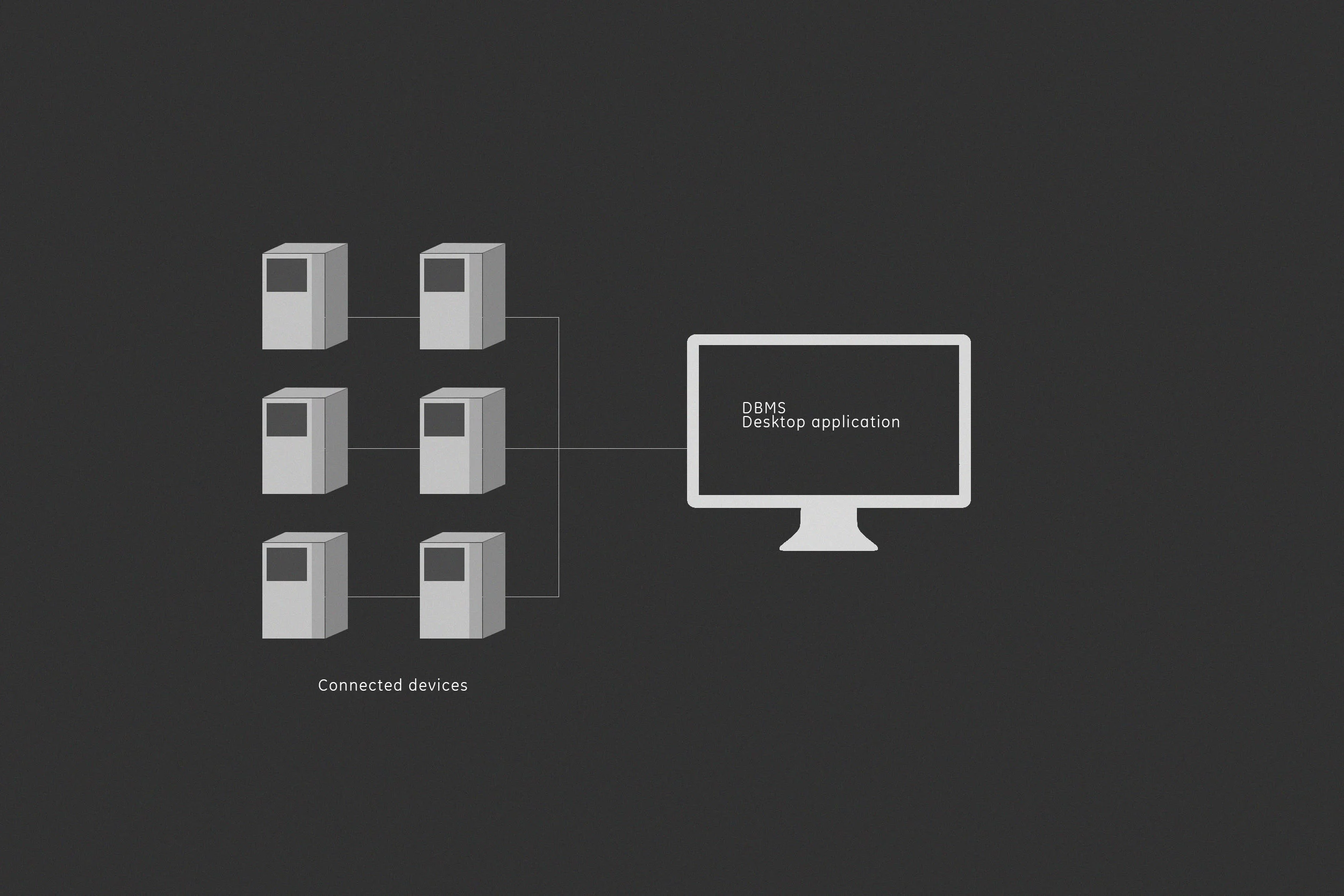
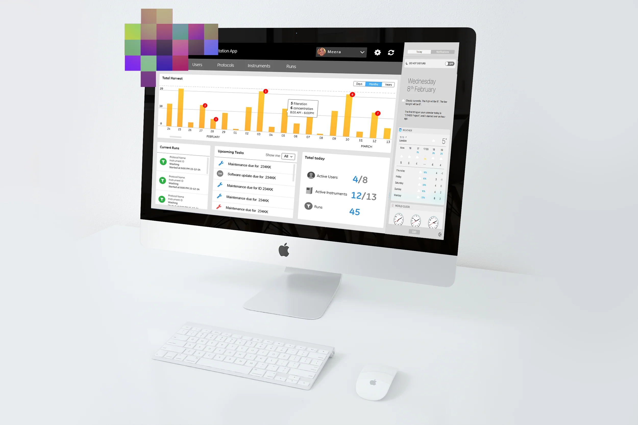
The second part of this project was a desktop based database management application which helped manage protocols and monitor all connected devices within a given facility. The app will assist Lab technicians enabling them to manage users, instruments and processes via one workstation.The design is minimal, gives the user just what is required for faster analysis and actions. My biggest learning from this project was the understanding of CRUD and the structure of a database management system.
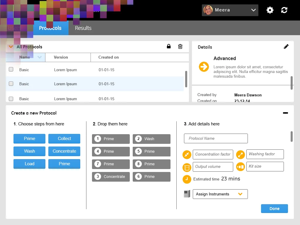
CONCEPT SKETCHES
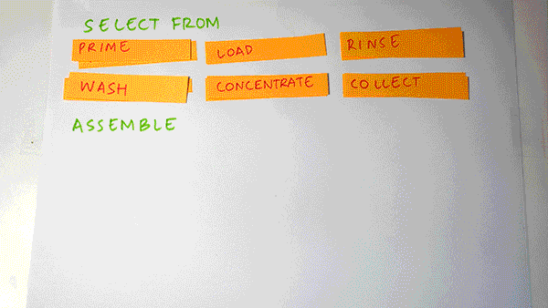
I quickly made this animated prototype to explain my idea of easy protocol creation. Below are screens showing how this further translated into the design.
All in all, this project was a great learning experience for me. The GE UX brand language is still under development as more products and systems get connected and branded under one umbrella. Applying a brand language that doesn't exist in entirety has its own challenges. I find such experiences extremely rewarding. Being responsible for creating an end to end solution had been a dream of mine. The project gave me a great sense of responsibility and appreciation for the lifecycle of a project from inception to deployment. The product is in its last phase of development and is soon to be released. Read more about cell expansion systems and bioreactors here.